Showing posts with label countries. Show all posts

Sunday, January 9, 2011

Free Shapefiles of Countries of the World (4)


Free Shapefiles of Countries of the World (4)


There was the suggestion to look at gadm (Global Administrative Areas), thanks for this suggestion. This blog handles this new source in detail. Note that some sources are apparently hard to find, i.e. not found immediately by googling to "world country shapefiles" or similar. I'm glad that this blog appears now in the first 10 results, so hope to provide by this an index to world country shapefiles.

Look also at  part 1part 2, and part 3 of this blog.

Large

This newly found shapefile is very interesting. The first observation is that it is rather large, the zipfile is 158MB and takes several minutes of downloading. Unzipped the triplet (shp,shx,dbf) is almost half a gigabyte. When we zoom in, we see how this is caused, it is a shapefile taken from a grid:

elba


The image above is a piece of the island Elba, the magenta line is the kml-ified shapefile displayed in Google Earth (yes, I like Google Earth).

I don't know if I like all those cornery borders... At least, it is not necessary to keep them, why are they not dropped or generalized away?

Anyway, if we zoom out a little again, the borders seem to be reasonably accurate at the first sight, here is the whole island Elba:

elba2


Vatican City and Liechtenstein

In last blog I described the small countries in and around Italy. So I shortly redo this for this new datasource. The gadm contains really the most accurate approximatino of Vatican City, compared with Google Earth as still our Single Point of Truth...

vatican

It is much better than all other sources found, and it therefore raises an interesting question: what is that little block where it differs, just to the southwest of Saint Peter's Square? Who is right there? And who is wrong? Interesting questions in the neighbourhood of the heart of the Roman Church... But we mean it geographically. Is Google failing here, as in Nicaragua and Costa Rica, nearly causing a war? Or is it the gadm.org website, a particular initiative providing freely available shapefiles for academic and non-commercial use (e.g. blogging)? According to Wikipedia, there indeed is a border dispute near Vatican City, but that is a little more to the east...

And look, we see a similar issue with Liechtenstein, probably a disputed valley...
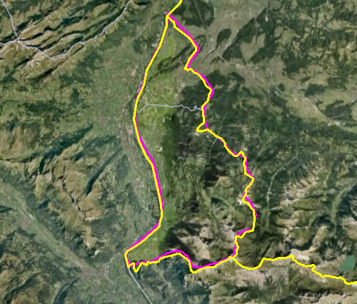
liechtenstein

But for the rest also here this shapefile is relatively accurate. For its size, accuracty is expected, of course...

Monaco

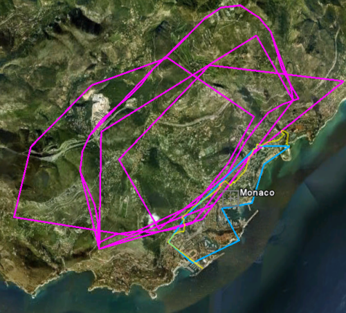
In last blog we saw that the borders of Monaco were correct in only one of the compared shapefiles... Alas, wrong again here:

Monaco

It seems hard to create a correct shapefile... What is the source of all those errors? Who is really right here? Of course Google! For all certainty I checked this at Wikipedia (because I've never been in Monaco). Yes, the yellow line of Google is following Monaco's portrayal within the Wiki page of Monaco. So alas, gadm is totally wrong here.


The Netherlands

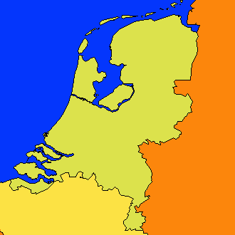
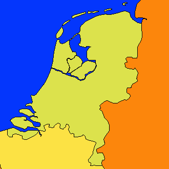
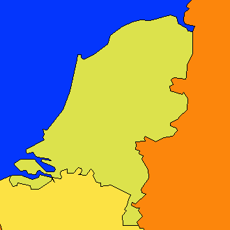
I'm living there, in that little country which is so difficult to be stored in free shapefiles... There is really a large lake, only bordered from the sea by a dike. That lake should be displayed, and it is not. If very small and uninhabited islands are displayed, the lake should really be there. And it is not the only error, in Zeeland the (smaller) water bodies behind the dikes are omitted as well.

nl

The Caspian Sea

This was another requirement (CS1). It is not as bad as it was in some other shapefiles, where the Caspian Sea was divided between surrounding countries. But the Caspian Sea is included as a separate country in gadm... Interesting. Do they issue passports?

Validity

Finally there is validity. All countries should be modelled as multi-polygons and be valid in both SQL Server and PostGIS. We've already seen that this requirement is met in only one caes, until now (11). And also for this case, 13, alas, there are many multi-polygons invalid in SQL Server. In PostGIS it is OK, though the query runs for a long time due to the excessive size of  the geometries. The values are post-editted in the previous blog.

Actually it is nice to show a variant of the query, using the with syntax:

with valid as (select ST_IsValid(the_geom) as v from world13)
select v,count(1) from valid group by v;

Conclusion

As always I'm glad with new shapefiles. This one is quite accurate, and in many aspects the best until now. But also, it is way too large, too cornery, and contains errors, as all others do...

So I think a good and freely available shapefile of the countries of the world is still very welcome.

If there are more shapefiles, I'm still interested, but especially I'm interested in a the Google country borders in any format? Are they available?

Monday, December 27, 2010

Free Shapefiles of Countries of the World (3)


Free Shapefiles of Countries of the World (3)


This is part three of the comparison of free shapefiles of countries of the world. After feedback, new sources, blogs and tweets (thanks everyone) on my previous blogs (part 1 and part 2), I decided to show some things more.

Edited: Note that part 4 handles an additional shapefile, referred as 13 here.

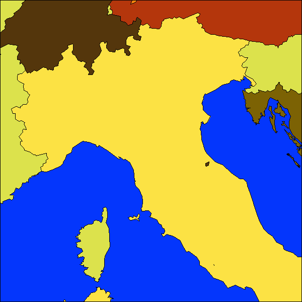
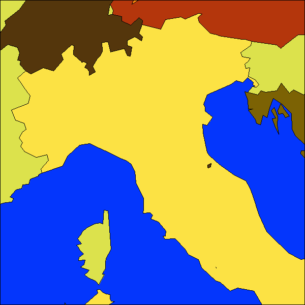
Let's now look at the north of Italy, where several countries are situates: Italy itself, France, Switzerland, Austria, Germany, Slovenia, Croatia, and some very small countries:
  • San Marino
  • Liechtenstein
  • Monaco
  • Vatican City
And I can't really believe what I saw today. Vatican City has been moved by some shapefile creators...

Vatican City

With respect to Vatican City, all shapefiles that I found are wrong. Below an image created with Google Earth showing boundaries. The yellow one is Google's, so not from a shapefile. It is accurate. I really want a shapefile with Google's country borders! Didn't found it until now, even not in KML-format. All others displayed, 3, 5, 6, 7, 9 are not accurate, but acceptable. I know that Vatican City is a very small country, that on a worldscale map you could not expect too much detail, so it might make sense that they display the country border only roughly. So these are all reckoned sufficient... with respect to the requirements, see more about that below.

im3b


But I was really amazed by the other ones, in the zoom out below. Those (1, 2, 8, 12) are all wrong. (Remember that all numbers refer to numbered sources from previous blog, completely listed below). About 1: we already knew that it was far too rough, and it is actually understandable: it exaggarates small countries to show them on a worldscale map. Understandable. But 2, 8 and 12 are completely wrong. Especially from 12 (source:  eurostat, europa.eu) you would not expect this. What has happened here...

im3a


Some sources (4, 11) do not have Vatican City at all.

Monaco

For Monaco it is a little better, in the sence that countries are not moved by 24 kilometers. But most shapefiles are more or less wrong, 12 being the only exception.

im2c

The Yellow line is Google again, and 12 is the cyan one following it. All the rest is wrong.

Liechtenstein and San Marino

The other small countries, San Marino and Liechtenstein, are both displayed more or less acceptable in all but 1, 2 and 8 (all omitted in the pictures - 8 is for Liechtenstein OK). Number 12 (cyan) also here follows Google the most closely.
im3d

Based on this pictures, 12 (from Eurostat) is following Google's country borders the most closely, with an amazing exception being Vatican City, where it is totally wrong. The rest of the sources shows not a real winner here.

Elba

Not a country, but also compared, the island Elba is another sample where the vertices of source 12 (Eurostat) follow the borders of the island quite closely. Cyan is the 3M version, blue the 10M, darker (and paler) blue the 20M. In the 60M version Elba is omitted. I agree with this all. The other borders, magenta here below, are all worse. And I omitted 1,2 and 8 here because they are even more wrong.

intersections_3e.png (500×355)

Requirements

In the last two blogs I made remarks about the quality, but I didn't really listed them as formal requirements. So let's start with that now. They are composed on the fly, and maybe a bit subjective, I know that.
  • NL1: The five inhabited islands in the Waddensea in the Netherlands should be present
  • NL2: The inner lake in the Netherlands should be included
  • NL3: The polders in the Netherlands should be visualized correctly, so absence of non-existing polders and presence of polders existing since 1968 (sometimes you have to make requirements quite explicitly...)
  • CS1: The Caspian Sea should be there
  • DB1: Countries should be one multi_polygon per country, not separate polygons
  • DB2: All (multi)geometries should be valid within SQL Server 2008
  • DB2: All (multi)geometries should be valid within PostGIS
  • SM1: Vatican City should not be moved and (probably) not be omitted
  • SM2: Monaco's borders should follow real borders
  • SM3: San Marino's borders should follow real borders
  • SM4: Liechtenstein's borders should follow real borders
  • SM5: Elba's borders should be followed

In the table below the requirement list is crossed against the shapefiles.

# NL1 NL2 NL3 CS1 DB1 DB2 DB3 SM1 SM2 SM3 SM4 SM5
1 OK OK -
OK OK 1 1 Enlarged Enlarged Enlarged Enlarged Very poor
2 OK OK - OK OK 4 4 26 km off Very poor Very poor Sufficient Very poor
3 OK OK OK OK OK 34 5 Sufficient Poor Sufficient Good Sufficient
4 OK OK - polygons OK 1 6 Omitted Poor Sufficient Sufficient Poor
5 OK OK - OK OK 5 4 Sufficient Poor Sufficient Sufficient Poor
6 2 OK - - OK 3 OK Sufficient Poor Sufficient Sufficient Poor
7 2 OK OK - OK 2 7 Sufficient Poor Sufficient Sufficient Poor
8 2 OK - OK OK OK OK 26 km off Poor Poor Sufficient Very poor
9 OK - - OK OK 17 9 Sufficient Poor Sufficient Sufficient Sufficient
9b OK - - OK OK 3 3 Sufficient Poor Sufficient Sufficient Sufficient
9c 0 - - OK OK OK 1 Sufficient Poor Omitted Sufficient Omitted
11 0 - - OK OK OK OK omitted Poor Sufficient Good Omitted
12 (3m) OK - - OK OK 13 1 24 km off Excellent Excellent Excellent Excellent
12 (10m) OK - - OK OK 4 OK 24 km off Good Good Good Good
12 (20m) 2 - - OK OK 2 OK 24 km off Good Sufficient Sufficient Sufficient
12 (60m) 0 - - OK OK 2 OK 24 km off Sufficient Poor Poor Omitted
Edited: 13 OK - - as separate
country
OK 47 OK Excellent Poor Excellent Excellent Excellent

All sources compared by image

The images below show the same picture, using all shapefiles, as we did in the previous blog, but now showing these four countries, Italy, and parts of the surrounding countries.
i1
  • (1)
  • from aprs
  • file world.shp

i2
  • (2)
  • from brothersoft, serving blue marble data
  • file World_countries_shp.shp
i3
  • (3)
  • from Geodan
  • file WorldCountries.shp

i4

i5
i6
  • (6)
  • from openmap here, called cntry02
  • file cntry02.shp
i7
  • (7)
  • from this site ESRI data
  • file cntry08.shp
i8
i9a
i9b
i9c
(10). Empty
i11
  • (11)
  • from huebler
  • file world_adm0.shp 
i12_3
  • (12 1:3m)
  • from eurostat
  • file cntr_rg_03m_2006.SHP
i12_10m
  • (12 1:10m)
  • from eurostat
  • file cntr_rg_10m_2006.SHP
i12_10m
  • (12 1:20m)
  • from eurostat
  • file cntr_rg_20m_2006.SHP
i12-60m
  • (12 1:60m)
  • from eurostat
  • file cntr_rg_60m_2006.SHP


Conclusion

Again thanks to commentor Alectora who suggested Eurostat, it is a nice set of four datasets in different scales. The 1:3 million version is excellent in most measures, but it is a pity that Vatican is displaced and the IJsselmeer in the Netherlands is omitted. And that some polygons are not valid...

I still think a good and free shapefile of the world is still welcome.


Wednesday, December 8, 2010

Free Shapefiles of Countries of the World (2)


Free Shapefiles of Countries of the World (2)


Note: read also part 3 and part 4 of this blog.

After input on my recent blog (thanks!) and after that I find two more, another post about this.

To judge the quality of the dataset, I use my own country (the Netherlands) as the primary measure. I've a mental map about my country, and know how it should look like. In many of the found datasets it looks completely destroyed. Therefore, personally I would discard them at once. Other datasets quite precisely depict my country. Maybe it is not only because I live here, but also about the topography: it has a large inner lake, it has some islands, and it has a distinctive shape.

So here the previous datasets, and four more, and some variations, come again...

world1
  • (1)
  • from aprs
  • file world.shp
  • from 2002
  • 244 countries
  • Missing a polder existing since 1968

world2
  • (2)
  • from brothersoft, serving blue marble data
  • file World_countries_shp.shp
  • from 1996
  • 239 countries
  • All shape is destroyed
world3
  • (3)
  • from Geodan
  • file WorldCountries.shp
  • from 2003
  • 253 countries
  • The Netherlands are depicted correctly

world4
  • (4)
  • from mapping hacks
  • file world_borders.shp
  • from 2004
  • 251 countries, 3784 polygons
  • Showing a polder which is never realized

world5
  • (5)
  • from thematic mapping
  • file TM_WORLD_BORDERS-0.3.shp
  • from 2008
  • 246 countries
  • Showing a polder which is never realized

world5b
  • (5b)
  • also from thematic mapping but the simplified version
  • file TM_WORLD_BORDERS_SIMPL-0.3.shp
  • also from 2008
  • also 246 countries
  • Badly simplified
world6
  • (6)
  • from openmap here, called cntry02
  • file cntry02.shp
  • from 2002
  • 251 countries
  • Showing a polder which is never realized, missing three islands
world7
  • (7)
  • from this site ESRI data
  • file cntry08.shp
  • from 2008
  • 249 countries
  • Missing three (inhabited) islands in the North. For the rest it looks like a good map on this scale
world8
  • (8)
  • from vdstech via this blog
  • file world.shp
  • from 2001
  • 251 countries
  • Badly simplified
world9
  • (9)
  • from natural earth
  • file 10m-admin-0-countries.shp 
  • from 2009
  • 251 countries
  • Missing the inner lake the IJsselmeer
world9b
  • (9b)
  • from natural earth
  • file 50m_admin_0_countries.shp 
  • from 2010
  • 240 countries
  • Missing the inner lake the IJsselmeer
world9c
  • (9c)
  • from natural earth
  • file 110m_admin_0_countries.shp 
  • from 2010
  • 177 countries
  • Too much simplified
(10). I wanted to do VMAP0 / VMAP1 here. However, my little research concerns a (one) shapefile of countries of the world. Vmap0 is great but to let users figure out all the detailed files and merge them for four parts
of the world is not the purpose I started the research with... so no picture here. Thanks for the tip anyway.
world11
  • (11)
  • from huebler
  • file world_adm0.shp 
  • from 2002
  • 209 countries
  • Missing the inner lake the IJsselmeer


Based on this series, (3) would probably be the best choice, though a bit heavily detailed. Surprisingly, it is created in the Netherlands... So we cannot judge its quality from this series. Furthermore,  (7) would be a reasonable choice, but we saw in the previous blog that (7) is wrong with respect to the Caspian sea. The new dataset (9b) is looking quite good to me for a map on world scale, but alas it misses an important lake. We might see more in another blog, for example showing the countries around the Caspian sea, or the countries in the former republic of Yugoslavia.


Conclusion

I think a good and free shapefile of the world is still welcome.

Thursday, December 2, 2010

Free Shapefile of Countries of the World


Free Shapefile of Countries of the World


Note: read also part 2 and part 3 of this blog.

I'm always surprised that it is hard to find a good shapefile with world countries. I need country vector data for Boost.Geometry sample data. There is some there but I want to have another set. I want to have it as WKT (Well-Known Text) and I can use a shapefile as input.

Asking Google for "free world map shapefile" you get:
  • aprs (1), with also a modified version
  • blue marble requires registration, but (probably) the same set can be downloaded from the next entry
  • brothersoft, serving blue marble data (2)
  • mapcruzin (leading to no countries but several interesting other shapefiles)
Via my company, Geodan, you can also download a worldmap, here (requiring mailing your contact information) (3)

Via free gis data, here, there is a hit on ESRI, leading to this site, leading to annual subscriptions etc.. I skipped this one.

Via similar terms ("countries") we also find:
  • mapping hacks, serving three world files (4)
  • actually originating from this site, which has a more actual version (5)
  • a file from openmap here, called cntry02 (6)
  • and finally (via "cntry08") we find ESRI data here (7)
I've downloaded these shapefiles. It gives me (file dates):
  1. is from 2002, modified in 2009 for Antarctica
  2. is from 1996
  3. is from 2003
  4. is from 2004
  5. is from 2008
  6. is from 2002
  7. is from 2008

The Netherlands
Let's first show my country, the Netherlands:
netherlands

All borders through each other look quite messy... But let's concentrate on the data.
Southern Flevoland, a polder, already existing since 1968, is still not there on maps from 1 (aprsworld, green) and 2 (blue marble, so blue). Of course it is present on the map of my company 3 (geodan, red), because Geodan of course takes care for its own country. Southern Flevoland is also present on all newer maps (5, pink, 6 orange, 7 gray). But on 5 and 6 it has a planned but not realized polder (Markerwaard) included. So best for the Netherlands are 3 and 7.

Of the five inhabited islands along the Waddenzee, 7 depicts only two. So here 3 is the best choice (of course, it is our country, and note that for the rest this is not a commercial talk)

For the whole world, 6 and 7 are quite similar in nearly all aspects

Uruguay
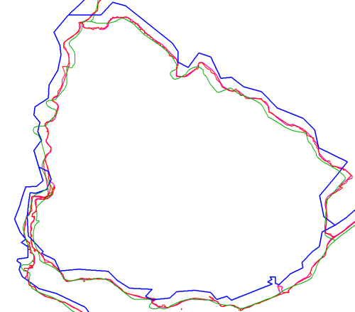
Let's now look at a country not part of Europe or US. I select Uruguay:
Uruguay

The blue vectors are quite rough and shifted to the west and north. Green lines are looking nice for a map on this scale, but deviate a bit from all other maps.

Let's now take a look in Google Earth. For this, we need to create a KML file...  hmm, shp2kml cannot be downloaded (blank website saying Missing ID). OK, we use PostGIS then, it can create KML and WKT (we need it below).

shp2pgsql -s4326 world.shp world1 > world1.sql

etc

So I created a database called blog and executed these SQL files.
Five minutes later (PostGIS is great) I do:
psql "-F " -A -n -t -q -Upostgres -dblog "-cselect '<Placemark>',ST_AsKml(the_geom),'</Placemark>' from world2 where name='Uruguay'" -otworld2.kml
 

Doing this for all tables and reworking the KML's  a bit (adding headers etc) gives me:
Uruguay with Google Maps

Considering Google Maps as our Single Point of Truth, we can discard the blue lines from Blue Marble, and might think that the green lines are also wrong. The rest is following the borders more or less but we need to zoom in to judge it better.

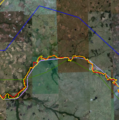
This is the new detail on a border:
Uruguay Google Detailed

The Yellow line is Google's line. The red line is following it, probably a bit too much. For a global scale, the other ones (4,5,6,7) are doing well here.

Caspian Sea
Looking at global level, we see immediately one thing, on which we zoom in here: it is surprising that the Caspian sea is not included in map 6 and 7. So the country borders are just across the sea... Not so good.
Caspian see

Not so good. So let's discard 6 and 7. We also see that the red lines (3) are too detailed, also here. Discard 3. Blue (2) and green (1) was already discarded before. So we keep 4 and 5, which are roughly the same. So I decide to keep the more actualy one: 5.

Decision
So we conclude, based on a few samples (and some more but not described here), that the file TM_WORLD_BORDERS-0.3.zip  from Thematic Mapping is the best shapefile to use for worldscale countries (even though it contains the Markerwaard).

Country number and validity
We did not consider attributes, and our research was still rough.

An important aspect we want to consider is geometric validity. And, even more important, the number of countries, it can differ over years, but the differences are sometimes still surprising.
Dataset Invalid (SQL Server) Invalid (PostGIS) #Countries Year
1 1 1 244 2002 / 2009
2 4 3 239 1996
3 34 5 253 2003
4 5 6 polygons 251 (3784 polygons (this dataset contains polygonsp; not multi-polygons) 2004
5 5 4 246 2008
6 3 0 251 2002
7 2 7 249 2008

About the countries themselves, I just glanced through the differences using a query, comparing ISO3 country codes, getting this table:
Compare 5 and 7

We see some inconsistent and some missing ISO codes, and some countries not in the one but in the other, and vice versa.


Conclusion

I think a good and free shapefile of the world is still  welcome.